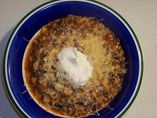
Nothing wrong with the focus. The framing is a bit off, but nothing some cropping can't fix.
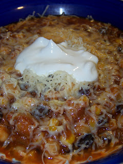
Shot #2, working the angle.
Closer, from an angle we don't normally get of our food. The reflection on the bowl is distracting, but the sour cream has a lovely creaminess, and the melty cheese drapes nicely. Maybe a bit too much cheese...The beans and corn of the chili is pretty much hidden.
But still, it's just a bowl of food.
Shot #3.
Oh, look, beer! And a spoon! The additional elements help...It's no longer just food, it's a meal...it's companionship...it's an event. Granted, you lose the detail of the melted versus unmelted cheese, but without the angle the chili components are visible. The shadow from the spoon and beer bottle is annoying though--should have killed the overhead light.
And my favorite shot.
Individual components of the chili: check! Depth and texture of the sour cream: check! Fewer elements, but more personalized with the hand (yeah, mine, whoop whoop). It's a decent angle, though I'd have been happier if more of the bowl was included. At least you can't see the edge of the bowl in far right corner, I guess. And the element of action, which I think really helps.
Not about the food...really! ;)


No comments:
Post a Comment